Cycling Jerseys by Country: A Global Visual Journey
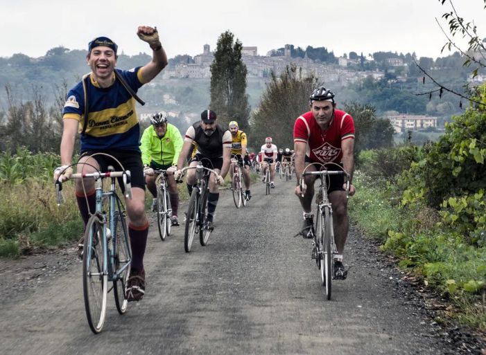
Cycling is more than just sport—it’s style, identity, and storytelling. Nowhere is that more obvious than in the jerseys worn by the pro peloton.
From bold block colors to artistic sponsor logos, each country has contributed its own visual flair to cycling fashion. Let’s take a global ride through the jerseys that shaped the aesthetic of the sport, one country at a time.
🇮🇹 Italy: Elegance on Two Wheels
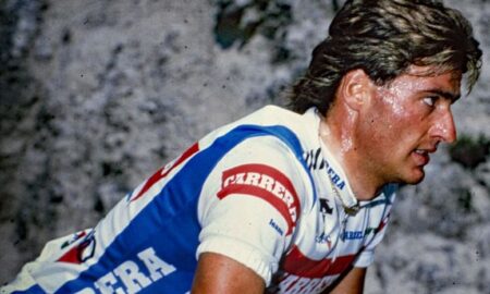
Italian cycling style is all about passion, flair, and fashion-forward design. Whether it’s the legendary Molteni orange, the sleek Bianchi celeste, or the sponsor-rich Carrera Jeans kits, Italian teams have always embraced bold design while keeping it chic.
- Bianchi (1950s–60s): Simple sky blue with black trim—a minimalist masterpiece.
- Carrera (1990s): Denim-printed lycra? Only in Italy.
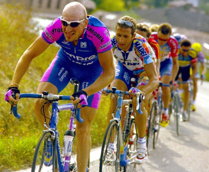
- Lampre (2000s): Unapologetically pink and blue, turning heads in every stage.
🇮🇹 Italy taught the world that cycling kits could be daring and dashing at the same time.
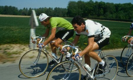
🇫🇷 France: The Heart of Tradition
France, the birthplace of the Tour de France, carries a legacy of classic designs, heritage sponsors, and understated pride.
- https://pullingturns.com/products/peugeot-cycling-long-sleeve-jersey/Peugeot (1970s): Black-and-white checkerboard perfection—still a fan favorite.
- La Vie Claire (1980s): Mondrian-inspired art on a jersey? A French revolution in kit design.
- Cofidis & FDJ (Modern Era): Clean blues, reds, and whites that echo the Tricolore.
🇫🇷 French jerseys balance innovation with homage to national style and historical grace.
🇪🇸 Spain: Bold Colors, Big Statements
Spanish cycling kits are often brash, colorful, and unmistakably Mediterranean in flavor. They reflect the sun-drenched roads, dramatic climbs, and fiery competition.
- ONCE (1990s): Bright yellow with a cartoonish logo—eye-catching and aggressive.
- Kelme: Neon greens and blues, embodying 90s energy and stage-hunting swagger.
- Movistar (2000s-present): Polished, modern, and consistently sleek in navy and lime.
🇪🇸 Spain brings drama to the jersey game, both visually and emotionally.
🇳🇱 Netherlands: Utility Meets Design
Dutch cycling kits are clean, bright, and technically sharp, just like their approach to racing. The Netherlands loves visibility and precision—on the road and in their jerseys.
- PDM (1980s–90s): Monochrome black-and-white with bold blocks—a timeless look.
- Rabobank: Orange dominance with hints of national pride, riding high in the early 2000s.
- TI–Raleigh (1970s–80s): Red, yellow, and black—blazing down cobbled classics.
🇳🇱 Dutch jerseys merge road visibility with minimalist design excellence.
🇧🇪 Belgium: Grit, Glory, and Color
Belgium may be small, but its influence is mighty. Known for its cobbled warriors, Belgian kits channel the rough-and-ready attitude of the classics.
- Mapei (1990s): Italian-registered, Belgian-dominated team, with iconic cube-patterned jerseys.
- Lotto: Bold red with black or yellow trim—clean and powerful.
- Eddy Merckx’s Faema & Molteni kits: Simplicity worn by greatness.
🇧🇪 Belgium’s jerseys are steeped in history, toughness, and undeniable panache.
Bonus: 🇺🇸 United States – Stars, Stripes & Corporate Power
While not as deeply rooted in cycling tradition, American teams brought corporate muscle and sleek branding to the sport.
- 7-Eleven (1980s): Red, green, and white stripes—retro Americana on two wheels.
- US Postal / Discovery Channel (1999–2005): Dark navy and minimalist, forever linked to dominance and controversy.
- EF Education (Modern): Pink disruptor kits with wild patterns and pro-swag.
🇺🇸 USA’s contribution? Branding brilliance and a touch of chaos.
Final Thoughts: Your Global Cycling Wardrobe
At PullingTurns.com, we celebrate these global icons every day. Whether you’re repping French classics, Italian legends, or Spanish flair, your jersey tells a story.
🧵 Explore the shop to build your own international peloton—one vintage jersey at a time.


Leave a Reply